


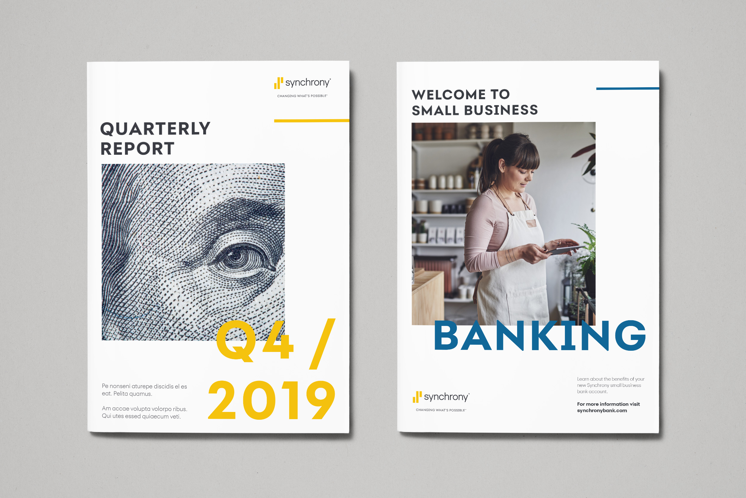
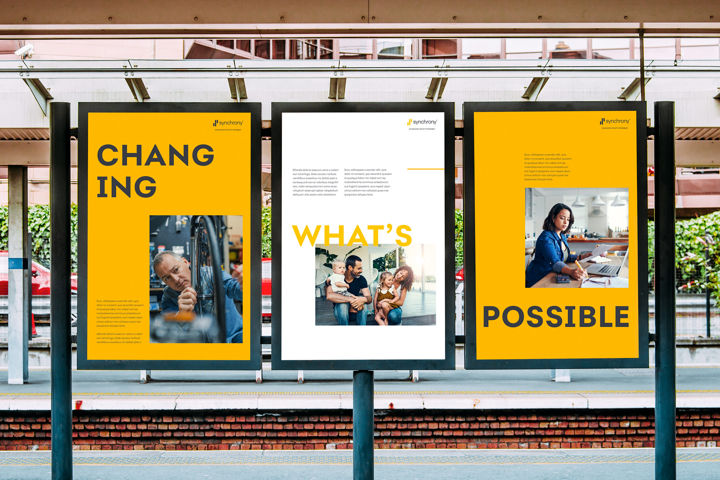

Synchrony is a Fortune 500 company that offers an array of consumer financing products. They are the largest provider of private label credit cards in the U.S., as well as offering promotional financing and loyalty programs, installment lending to industries, and FDIC-insured savings products. While at Giant Spoon, I was tasked with conducting a refresh of Synchrony’s visual identity, elevating and amplifying the brand’s visual expression. One of the primary goals was to bring a greater level of sophistication to Synchrony’s marketing and communications, while preserving key brand elements. The resulting platform celebrates the brand’s color heritage in gold and charcoal, while establishing a bold new typographic system and information hierarchy. Throughout the identity, the use of white space allows elements to breathe and helps Synchrony’s services feel open and accessible. The style guide I developed introduced a new logo lockup with the “Changing What’s Possible” tagline, as well as rules governing the identity’s application to print, web, and social.